Setting Up Your Collection Profile
This guide covers setting up your collection profile on Scatter. If you have not deployed yet, start with Deploying Your Collection.
Step 1: Open Collection Editor
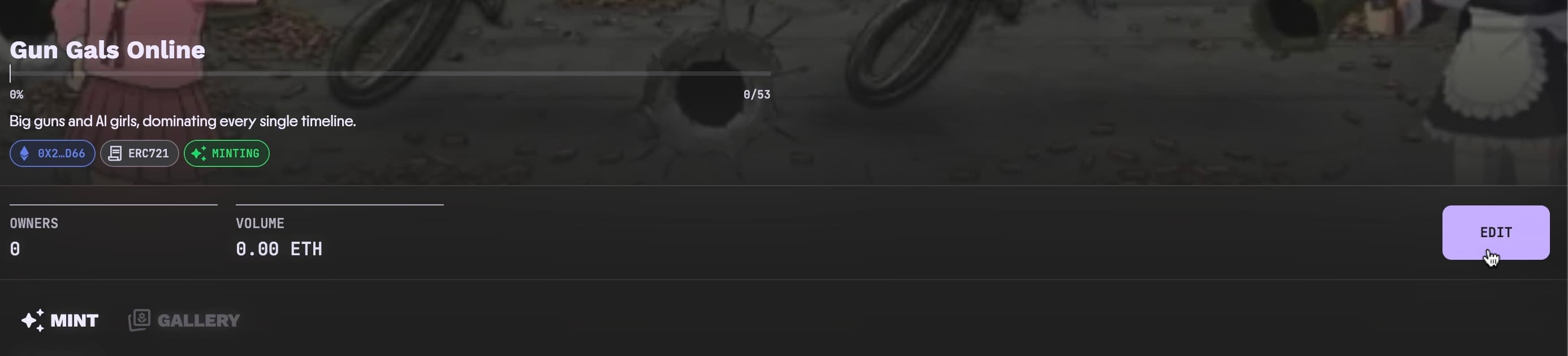
Go to your collection page on Scatter with your wallet connected and click on the Edit button.
Step 2: Complete the Profile Tab
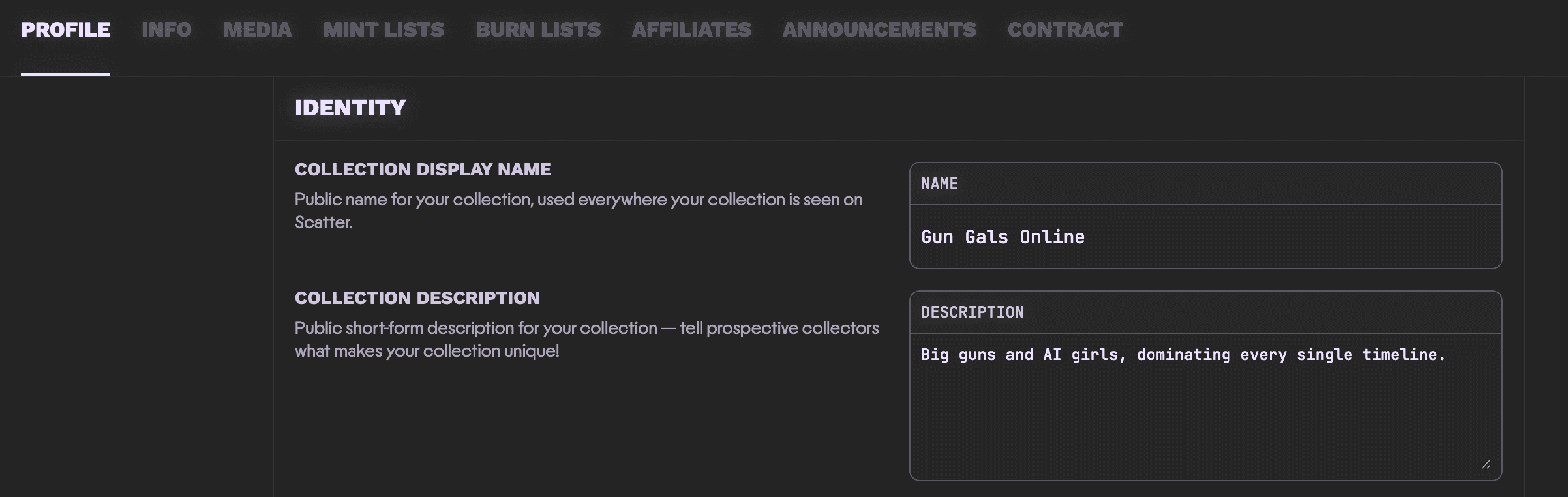
Under the Profile tab you can set name display, description, links, and collection images.
Set your collection's name and description.
Next, upload your images.
- Avatar: Around 128x128 to 512x512, GIF/PNG/JPEG.
- Banner: Around 1024x256 to 2048x512, GIF/PNG/JPEG.
Keep image files below 10MB.

Custom Collection Themes
Scatter supports custom theming for your collection page. Themes let you control the visual presentation of your collection on the Scatter webapp, giving you the opportunity to make sure the entire minting, collecting, and trading experience for your collection matches your preferred visual identity.
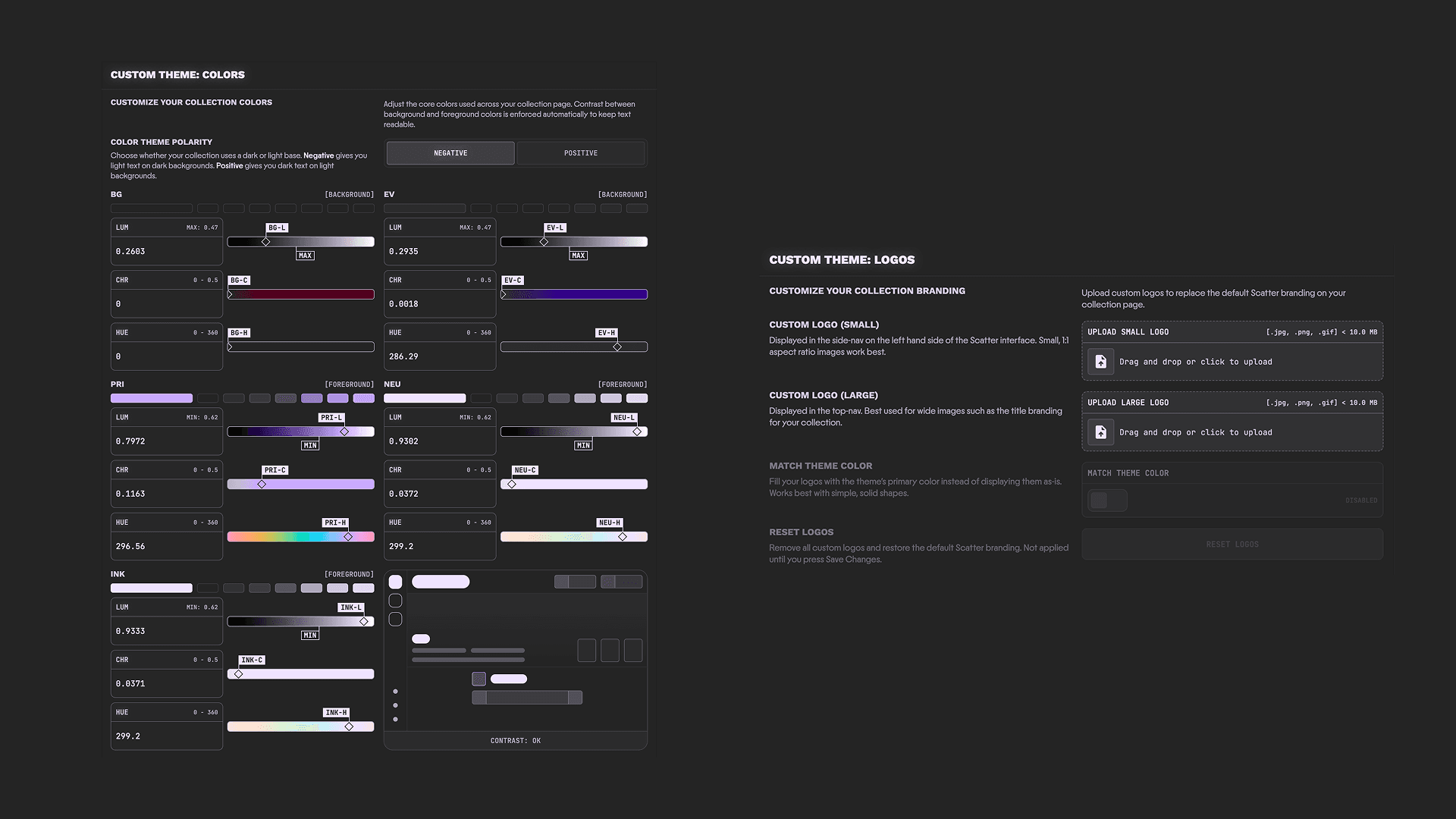
Scroll down on the Profile tab to find the Custom Theme sections for Color Themes and your collection's Theme Logos.
Custom Color Themes
You've probably never seen a color picker like this before — don't be overwhelmed! Scatter's custom theme color editor is uniquely designed to balance frictionless color picking (Overthinking-proof), readability (Impossible to create ugly, unreadable color schemes) and creative flexibility (Go wild with your colors!).
This is achieved through a few simple practices:
-
We use the OKLCH ↗ color space — a perceptually uniform color model that maps how humans actually see color, not how screens produce it. If that all sounds like too much, don't worry — it just means you can freely drag sliders around and your theme will never end up with unreadable text or clashing contrast.
- LUM = Luminance: Think in terms of 'brightness', only better! This is the perceived intensity of the light used to mix your color. Generally speaking, the higher the LUM, the closer you get to pure, blinding white.
- CHR = Chroma: How vivid or saturated your color feels. Low chroma gives you muted, understated tones — crank it up and you get rich, punchy color. Zero chroma is pure gray.
- HUE = Hue: The actual color on the wheel — red, blue, green, and everything in between. This is the slider you can have the most fun with, because OKLCH ensures that shifting your hue preserves perceived brightness and contrast. Spin it freely — your theme stays readable no matter where you land.
-
The entire Scatter webapp is built with just 5 core colors in our unique design system — 5 colors is all you need to customize your collection pages any way you want! Each of the 5 colors has its own semantic purpose, but the names are intentionally ambiguous. Don't worry about it! This is by design to encourage you to experiment and be creative with your theme building. If you're curious though...
- BG = "Background": The background color for every page, plays a big role in setting the tone for your custom theme.
- EV = "Elevation": Some elements need to give the impression they are visually slightly 'elevated' above the background — think Cards, NFT Specimen Thumbnails, etc. — that's what the EV color is for.
- PRI = "Primary": The star of the show, your 'hero' color. Generally this will be the loud, most intensely 'branded' color in your color theme. It's typically used as an 'accent' color to draw attention to key elements.
- NEU = "Neutral": Think of this like a little brother to PRI. It's a workhorse and constitutes the vast majority of the non-background coloring for your theme.
- INK = "Ink": The simplest to wrap your head around — is it text (or an icon)? If so, it uses the INK color!
Just 5 colors — endless possibilities.
-
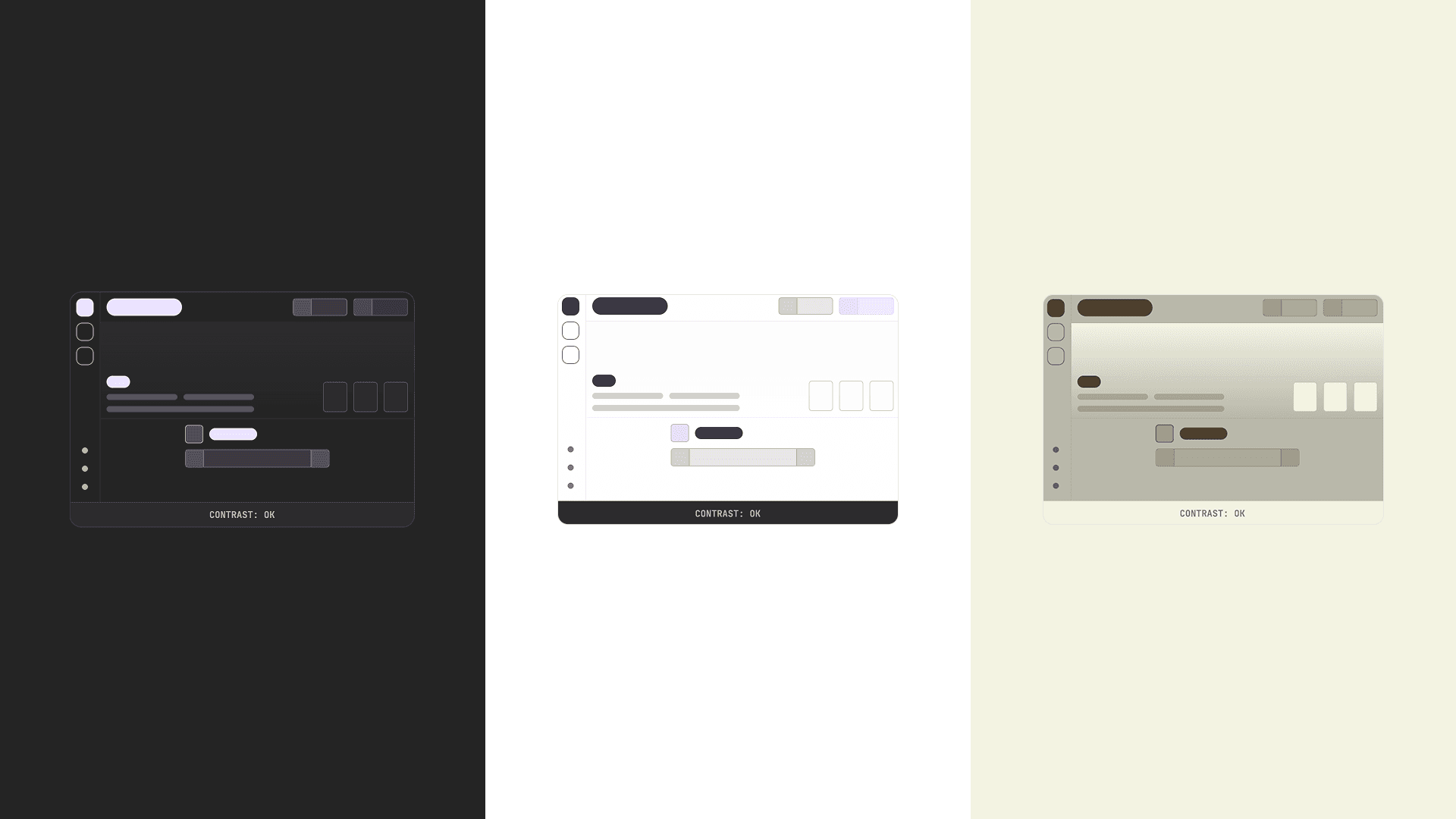
Readability is guaranteed — no matter what. You'll notice MAX and MIN flags on the Luminance sliders. These are guardrails — they prevent you from creating a theme where text blends into the background. You can drag your sliders as far as you want, but you can't cross those thresholds. That's the entire system. Go wild — Scatter won't let you make something unreadable.
The only choice you need to make is your Polarity:
- Polarity: Not every theme fits the "dark mode / light mode" split perfectly, so we think in terms of polarity instead. Negative means light text on dark backgrounds. Positive means dark text on light backgrounds. Pick whichever direction suits your vibe.
Your 5 colors are split into two groups for contrast purposes:
- Background group: BG + EV — your base layer.
- Foreground group: PRI, NEU, and INK — everything that sits on top.
In Negative polarity, background colors get a MAX luminance cap (they can't get brighter than the threshold), and foreground colors get a MIN floor (they can't get darker than the threshold). In Positive polarity, it's the reverse.
The one thing to keep in mind: the threshold is measured from the most extreme value in the opposite group. For example, say you're in Negative polarity and you set BG to 0.3 and EV to 0.5. The foreground MIN will be based on EV's 0.5 (the highest luminance in the background group), not BG's 0.3. This means if you push one background color brighter, the foreground minimums rise with it — keeping contrast intact automatically.
Custom Logos
Upload your own logos to replace the default Scatter branding on your collection page. If you don't upload custom logos, Scatter's default branding will automatically adapt to your theme colors — so your page will look cohesive either way.
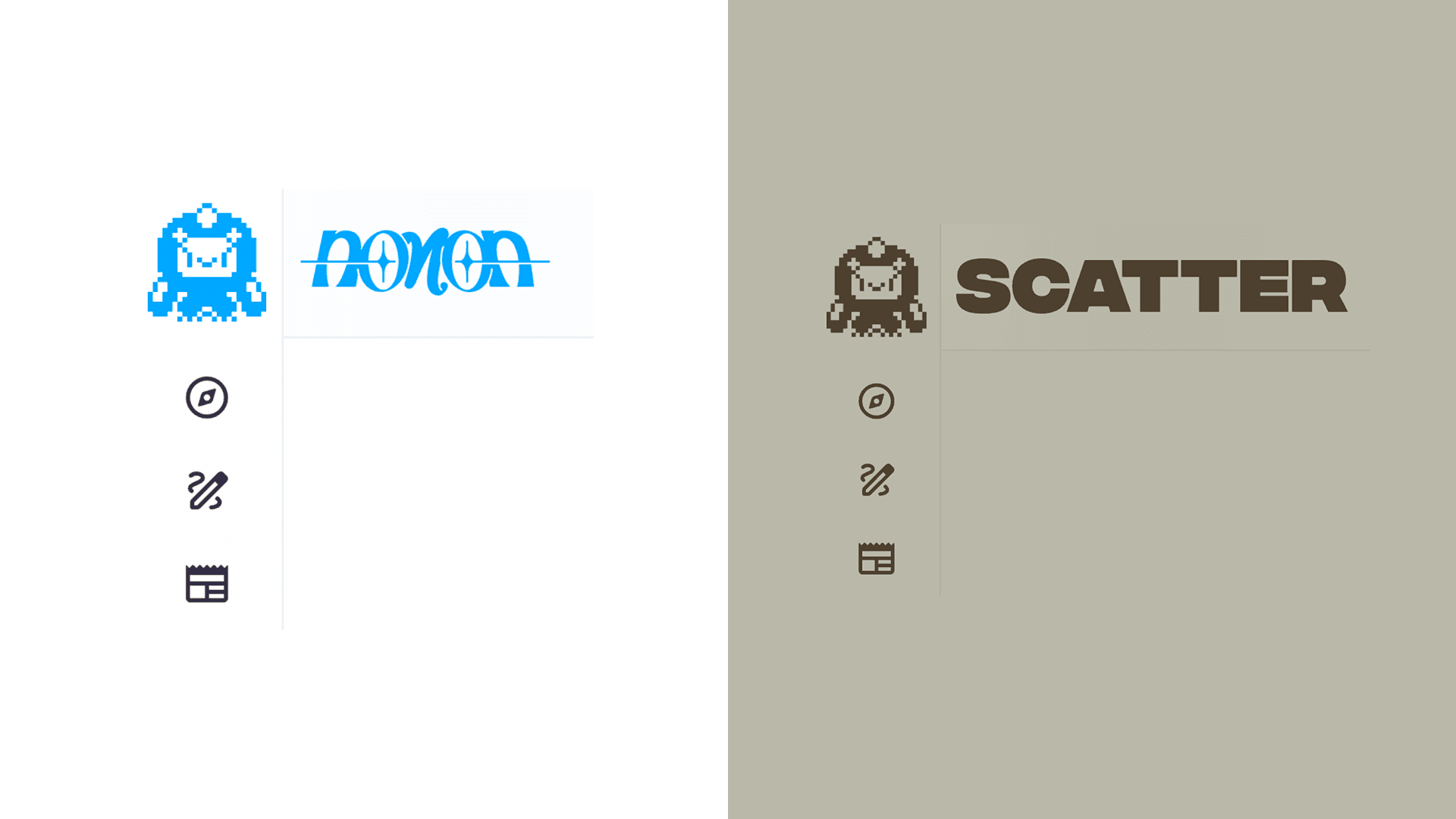
- Small Logo: Displayed in the side-nav on the left hand side of the Scatter interface. Small, 1:1 aspect ratio images work best.
- Large Logo: Displayed in the top-nav. Best used for wide images such as the title branding for your collection.
- Match Theme Color: When enabled, your logos are automatically filled with your theme's PRI (Primary) color instead of displaying as-is. Works best with simple, solid shapes — perfect for flat icons or clean wordmarks.
- Reset Logos: Removes all custom logos and restores the default Scatter branding. Not applied until you press Save Changes.
Accepted formats: .jpg, .png, .gif — max 10MB per file.
Collection Visibility
Collections are hidden by default. When everything is set up and you are ready to reveal your collection to the public, enable Public Visibility and click Save Changes. We recommend uploading your media and setting up minting first and coming back to enable this when you are ready.

Know the Other Settings
You will also see these tabs in the editor:
- Info: Overview of collection and contract information.
- Media: Upload and manage collection media.
- Mint Lists: Configure who can mint, when, and at what price.
- Burn Lists: Configure burn-to-mint.
- Shills: Configure shill minting.
- Announcements: Create and manage announcements for your collection.
- Contract: Advanced contract controls.
Next Step
Continue with Uploading Content.